Grafana Visualization
Function
Grafana can visualize profile data collected and analyzed by the profiler.
Data Preparation
Complete the operations in Data Parsing and obtain the parsing results (Parsing Results).
Make sure that the SQLite database file profiler.db exists in the path specified by --output-path.
Environment Dependency
Tool versions: Grafana 11.3.0 and SQLite plugin 11.3.0
Installing and Connecting Grafana
Download the open-source version of Grafana from its official website. Decompress and run it. The following provides an example:
tar -zxvf grafana-11.3.0.linux-arm64.tar.gz
cd grafana-v11.3.0/bin/
./grafana-server
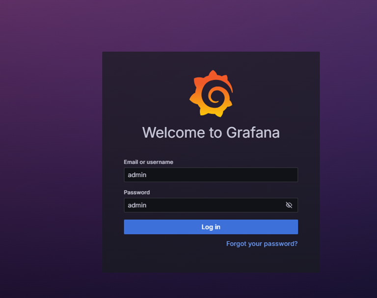
To configure the Windows proxy, add the IP address prefix of the Linux device, for example, 90.90.*;90.91.*. You can access http://Linux device IP address:3000/ to open the Grafana web UI. The initial account and password are admin.
Example
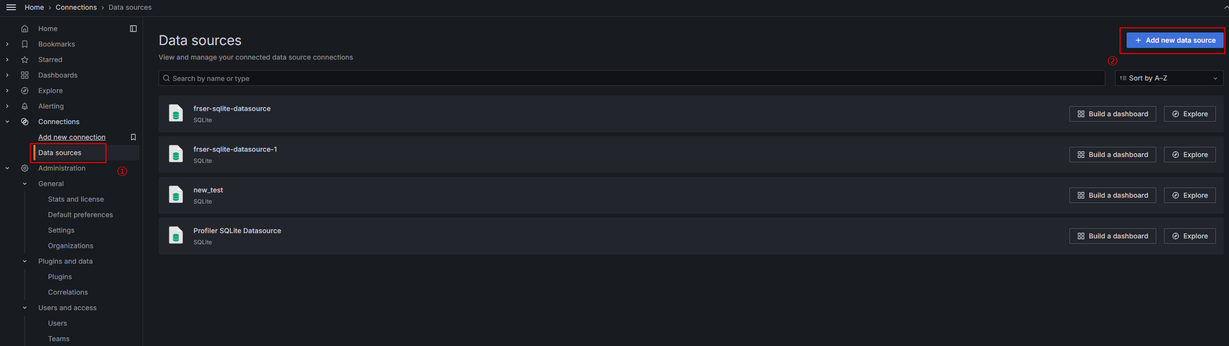
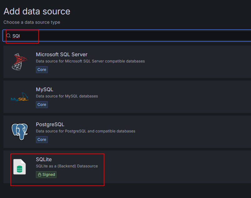
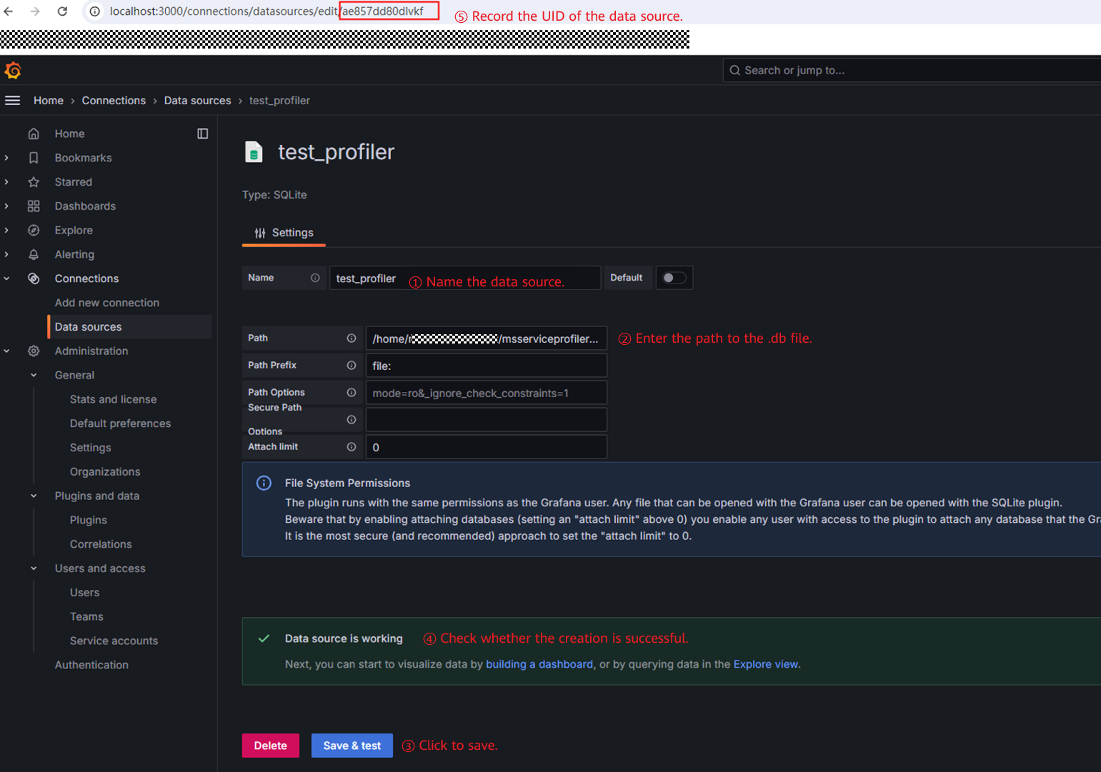
- Create a data source, as shown in Figure 2.
- Create a dashboard and import a line chart.
Locate the visualization file profiler_visualization.json in /xxx/Ascend/cann-{version}/tools/msserviceprofiler/python/ms_service_profiler/views/ and change uid in datasource to the UID recorded in step 2.

{cann_version} indicates the CANN software package version. CANN 8.1.RC1 and later versions are supported.
Figure 5 uid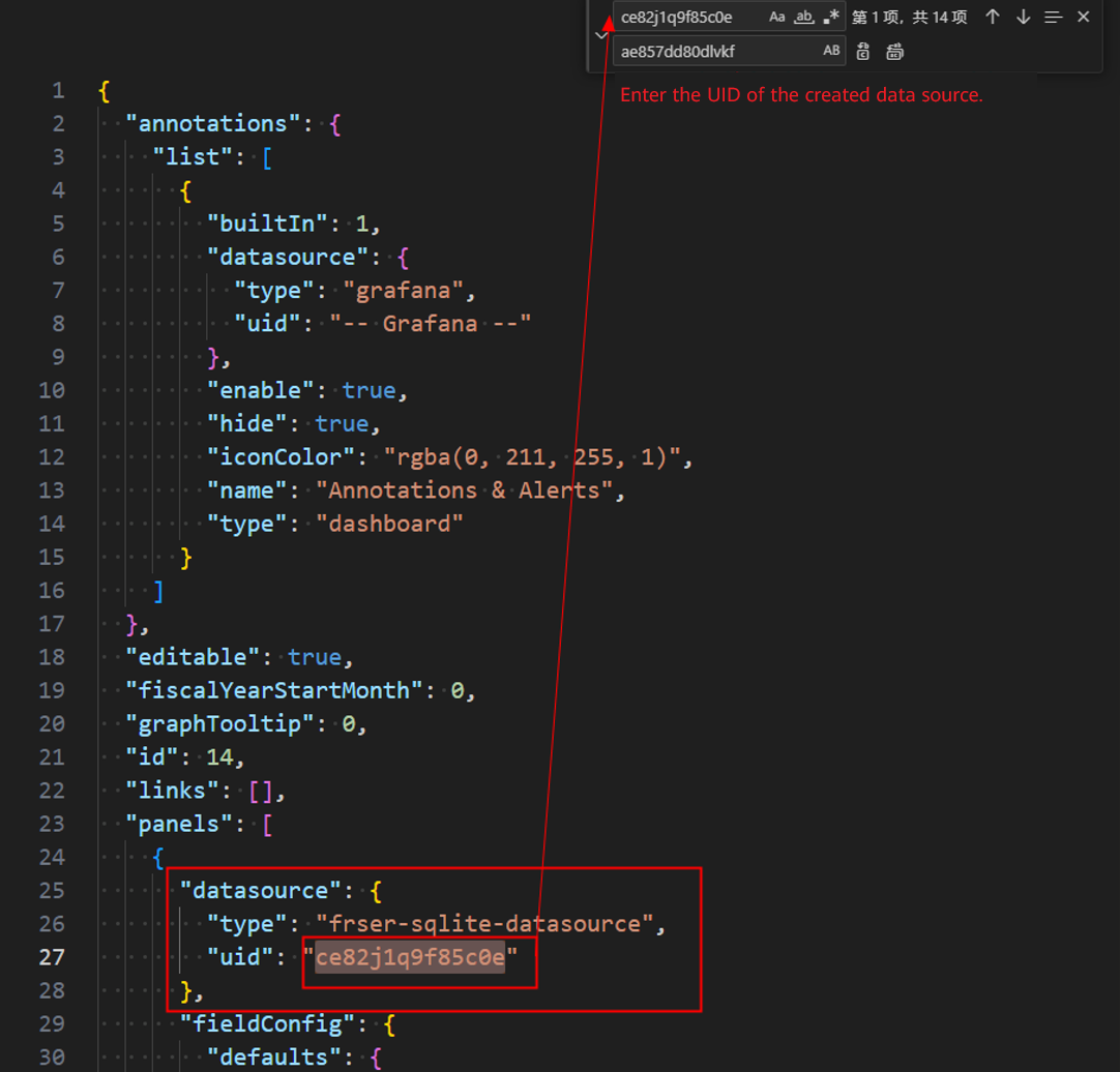
uid at the end of the .json file uniquely identifies the dashboard and does not need to be modified. title specifies the dashboard name, which defaults to Profiler Visualization.
Figure 6 .json file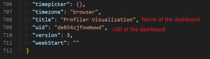
- Create a dashboard and import the modified .json file. You can find the dashboard with the corresponding name in Dashboards.Figure 7 Dashboards
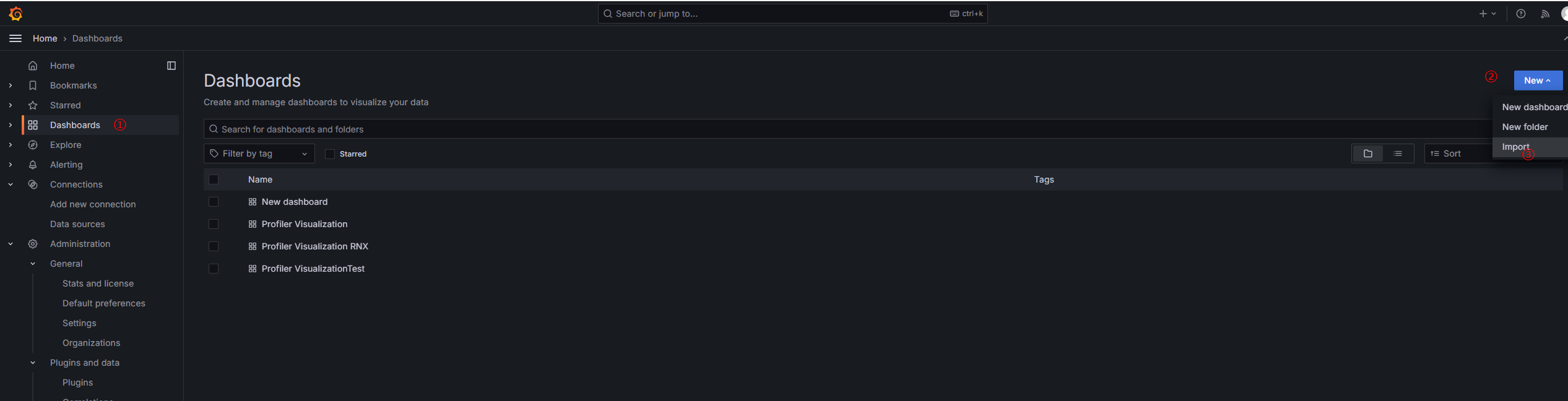 Figure 8 Import dashboard
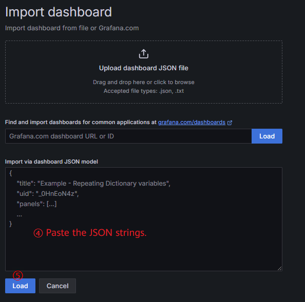 Figure 9 Configure parameters.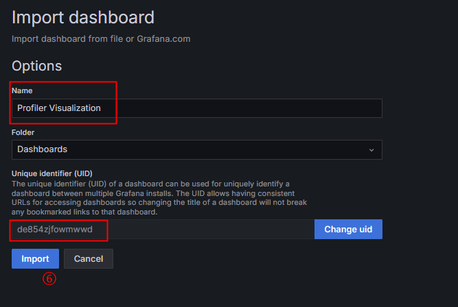
Visualized Results
The generated Grafana dashboard contains the following visualized charts:
Chart |
Description |
|---|---|
Batch Size by Batch ID |
Line chart showing the number of requests in each scheduled batch, distinguished by prefill and decode phases over time |
Request Status |
Line chart showing the number of requests in different states over time |
Kvcache usage percent |
Line chart showing the KV cache usage of all requests over time |
first_token_latency |
Line chart showing the time to first token (TTFT) of all requests over time, including the average TTFT, as well as the 99th, 90th, and 50th percentile values |
prefill_generate_speed_latency |
Line chart showing the average token latency of all requests in the prefill phase over time, including the average token latency, as well as the 99th, 90th, and 50th percentile values |
decode_generate_speed_latency |
Line chart showing the average token latency of all requests in the decode phase over time, including the average token latency, as well as the 99th, 90th, and 50th percentile values |
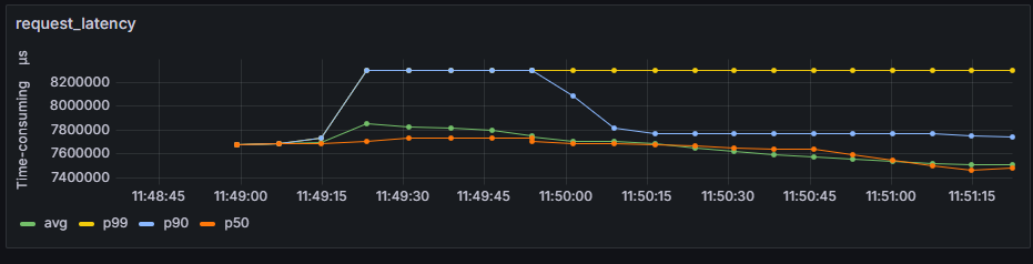
request_latency |
Line chart showing the end-to-end latency of all requests over time, including the average end-to-end latency, as well as the 99th, 90th, and 50th percentile values |
- Batch Size by Batch ID
Line chart that shows the number of requests in each scheduled batch
x-axis: represents the chronological batch index, beginning with 0.
y-axis: represents the batch size, distinguished by prefill and decode batches.
Figure 10 Batch Size by Batch ID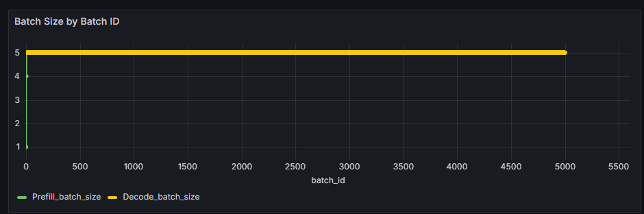
- Request Status
Line chart that shows the number of requests in different states over time
x-axis: represents the timeline of the inference serving.
y-axis: represents the total number of requests in this state at the current time.
Figure 11 Request Status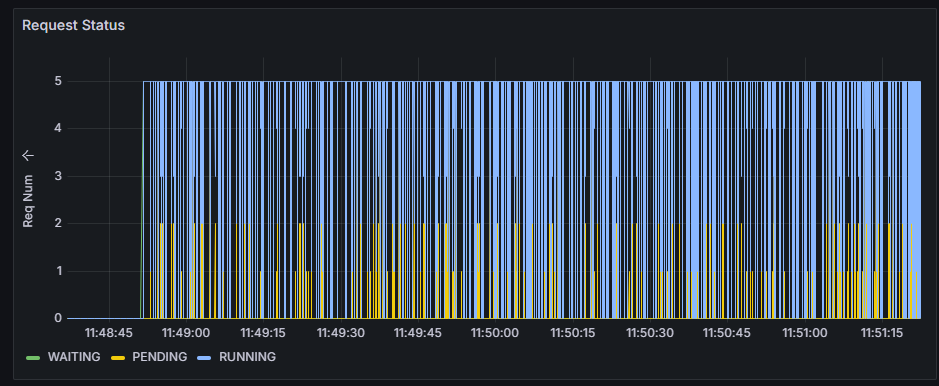
- Kvcache usage percent
Line chart that shows the KV cache usage of all requests over time
x-axis: represents the timeline of the inference serving.
y-axis: represents the KV cache usage of all requests. Unit: %
Figure 12 Kvcache usage percent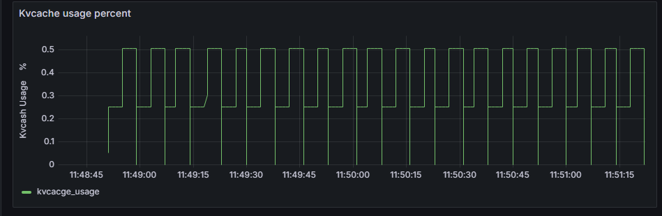
- first_token_latency
Line chart that shows the token latency of all requests over time
x-axis: represents the timeline of the inference serving.
y-axis: represents average TTFT of all requests, and their 99th, 90th, and 50th percentile values. Unit: μs
Figure 13 first_token_latency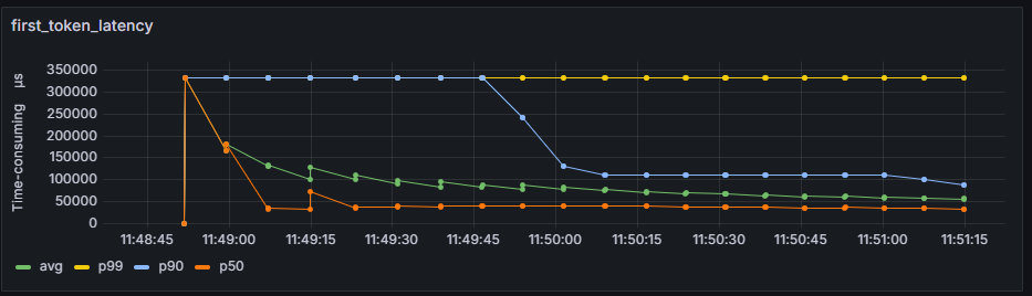
- prefill_generate_speed_latency
Line chart that shows the average token latency of all requests in the prefill phase over time.
x-axis: represents the timeline of the inference serving.
y-axis: represents the average token latency, as well as the 99th, 90th, and 50th percentile values in the prefill phase over time. Unit: tokens/s
Figure 14 prefill_generate_speed_latency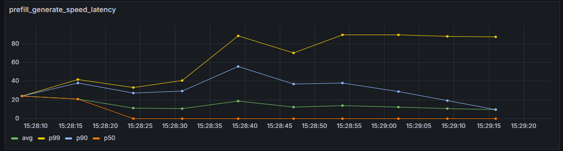
- decode_generate_speed_latency
Line chart that shows the average token latency of all requests in the decode phase over time
x-axis: represents the timeline of the inference serving.
y-axis: represents the average token latency, as well as the 99th, 90th, and 50th percentile values in the decode phase over time. Unit: tokens/s
Figure 15 decode_generate_speed_latency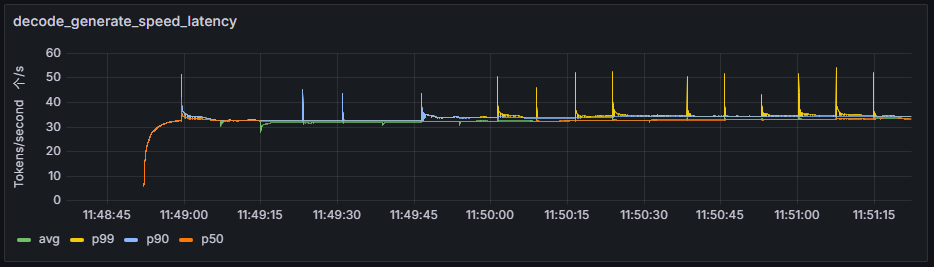
- request_latency
Line chart that shows the end-to-end latency of all requests over time
x-axis: represents the timeline of the inference serving.
y-axis: represents the average end-to-end latency of all requests, and their 99th, 90th, and 50th percentile values. Unit: μs
Figure 16 request_latency